4.09.2015

Professional Practice and Engagement - Week 7


What does sustainability mean in context of Graphic Design? 

Sustainability in Graphic Design context is to care for the earth and living thing on earth when design. Designer should try to reduce the impacts to the environment when do the design works, or create some design that could help the world to become a better place.

............................................................................................................................

What is 'cradle to cradle' design and how can you see this applied in the Graphic Design industry?

“Cradle to Cradle” thinking posits that intelligent design can eliminate the concept of waste. Cradle to Cradle design refers to a production process where products are developed for closed-loop systems in which every output ingredient is safe and beneficial. The concept was developed by William McDonough and Michael Braungart.

Reference: http://www.bcorporation.net/sites/default/files/documents/portal/BCorp_Cradle_to_Cradle_Design_and_Production.pdf

Sustainable design seeks to reduce negative impacts on the environment. Graphic designers might apply the concept in Graphic Design industry by reducing resource use through the design process. Graphic designer could use eco-friendly material such as recycling paper for our publication design or a packaging design. Also, we could create something.., for example, How2Recycle Label, a standardized on-package labeling system that clearly communicates recycling instructions to the public.

You can see more examples at http://www.greenblue.org/
(GreenBlue is a nonprofit institute that stimulates the creative redesign of industry by focusing the expertise of professional communities to create practical solutions, resources, and opportunities for implementing sustainability.)

............................................................................................................................

There are many things that a Graphic Designer can do in their practice to decrease their impact on the environment. 

For example,

- Use eco-friendly or paper and materials made with recycled, post-consumer waste for the design piece, e.g. design a publication using recycle paper.
- Use low VOC ink for printing materials
- Choose a recycle material, such as glass, for Packaging Design.
- Create a good, clear, and interesting infographics about our environment to inform people.
- Help to create an non-profit effective ads for earth.

............................................................................................................................

In the 'Creative Gallery on Sustainable Communications '- what ad has the most impact for you and why?

The most impact ads for me is "Graph" For WWF.


It impacts because it's really easy to understand. The way they use the pattern of the tiger to play with the graph is very smart. When I first see the picture, I can guess that it's something about tiger. When I look closer in the bigger image, my expression is like "Wow!". The way they put the information is very minimal, but can understand right away that in present, the number of tiger is decreasing.

See the ads at http://www.unep.fr/scp/communications/ad/list.asp?cat=all

Professional Practice and Engagement - Week 6

This week is about Design and Ethics..

Free pitching is a predatory pricing. It is the practice that every designer should take responsibilities to other designers. According to AGDA, designers must not knowingly accept a commission to work on the project which there is an existing designer without informing them. If not, it could damage the industry as a whole, no one will respect each other and the others works. The clients might push the budget down and designer's design will be stolen easily.

It is important to have a code of ethics, so it is a 'Fairplay'. Code of ethics intended to provide protection for both designers and clients from unethical business practices and the havoc that can be caused by unwitting ignorance. Most probably, everyone will have less chance to cheat and steal others' ideas.

To be a designer, it is good to know different measures to protect our creative output.

Design registration is when the visual appearance of visual appearance is protect, not the way it works.

A patent protects how an invention works or function.

A trademark identifies the particular goods or services of a trader as distinct from those of others. It protects logos, words letters, number, colors, a phrase, sound, scent, shape, picture, aspect of packaging or any combination of them.

Copyright is when the owner's original expression of ideas is protected but not the ideas themselves. It can protects drawing, art, literature, music, film, broadcast, or computer program.

Copyright protection lasts throughout the life of the creator, plus an extra 70 years from the author or creator's death. While a trademark is initially register for a period of 10 years and continues indefinitely as long as the renewal fees are paid every 10 years.

As a freelance designer, I think the measure that will be most important is a copyright. It can protects all of my idea, such as my logo, website, etc. It is also important to keep track of the process of how we're working as the evidence, in case someone is stealing our ideas, to show to court. Moreover, if I want to sell our design work or work for clients, I might need to register a trademark, a patent, or even the design registration.

4.03.2015

Professional Practice and Engagement - Week 5

To work as a freelance designer, I have to think and calculate what clients should pay for, and how much should I get per an hour. I've try to search through http://www.seek.com.au to see how much they hire designer and junior designer per an hour. Some companies or studios propose to give very high salary but some are not. Base on my skill and experience, I am just a junior designer. Most of Junior designers get paid for around 25-45 Australian dollars per hour. As a freelance junior designer, I prefers to get 35-45 dollars per hour, the charge is depending on how much skill I needed to use, and how hard the work is.

This is self-branded Timesheet I've created.

Important Note: I choose to posted .png image instead of .jpg because when I posted .jpg white background appears weird.

3.17.2015

Professional Practice and Engagement - Week 4

Using the Johari Window tool (http://kevan.org/johari) work out how I see myself and how others see me. And here is the result ...

I selected able, loving, proud, sensible, sentimental, and sympathetic. Many people see me as, able, loving, and sentimental, but not proud, sensible, and sympathetic. The big blind spots, or how most people see me as, are accepting, friendly, happy, intelligent, kind, nervous, silly, and wise. 

How others see me is quite similar to how I see myself, i think it's because I love to express my true self, especially when I'm with family and close friends.


The attributes described in Johari Window exercise I see as keys to dealing with clients are able, accepting, and wise. Because to deal with clients I need to be able to deal with them on the objective of the project, to accept any kinds of the design brief, and to come up with the wise plan of budgeting and managing the process, in order to produce a successful outcome.

The attributes that are keys to dealing with colleagues could be loving, friendly, happy, and kind. Because to be friendly, to love, and to be kind with people around me, or people who I need to work with, is good thing. The colleagues and I can stay together comfortably. We can talk and discuss like friends and family. If I am happy, I can also make other happy because if there is one happy person in the atmosphere, it could lead the happy atmosphere. The working atmosphere will be good. If the atmosphere is good, everyone will be creative. "When collaborative is creative, the result usually are too," AIGA stated in A Client Guide to Design 2007.

To dealing with myself, I think I need to accept myself as who I am, because to accept and to know one's self will be the main attribute to use in dealing with self. Along as practicing and finding the way to calm myself, for example when I am too nervous. To love myself and know make myself happy are also the keys.

For me, key attributes to dealing with the boss is similar on how to deal with self, colleague, and clients. I need to accept the clients from the boss, make boss happy with me and my works, and be responsive and spontaneous, so that my boss can trust and happy to work with me.

Overall, this exercise reflects anythings that I may or may not recognize about myself. Somehow it makes me feel more confident and want to keep doing good works. I quite happy that some people know me well, and some even see some good things that I am surprise to see, such as helpful, patient, and trustworthy. Because many times, I just play around and act something silly.

Similiar to previous exercise, I think that I could be a good boss. Because I love to control and manage the overall image. I would love to be able to take care the colleagues seriously. I want to control and make the working atmosphere good and happy. I think I won't be happy if may things are out of control. Before that could happens, I think I also need to develop many parts of me. I think I need to control my nervousness, do silly stuff only in some occasion, be more confident, be more responsive, and always read and learn new things which could be useful in my future career as a boss.

3.15.2015

Professional Practice and Engagement - Week 3

I always love to create my design based upon small units.
I also love to create colorful and playful design.
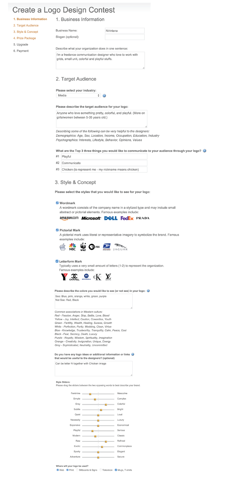
So I come up with this logo, the combination of Letter N and Chicken.
N represent Nirintana | Chicken is the meaning of my nickname Kookai (Thai)
I choose these colors because they are my most favorite.


This is my CV template I created by myself.

Important Note: I choose to posted .png image instead of .jpg because when I posted .jpg white background appears weird.


Here is the screen shot of 3 steps after set up a Logo Design Contest in http://logotournament.com


3.10.2015

Cross Media Case Study - Doraemon


Nirintana Koomanee U3140293
Vanilla Leung U3034802


Cross Media Cast Study - Doraemon

Doraemon is a famous Japanese manga (comic book), which became a very successful anime series and media franchise. It was written and illustrated by the manga writing group of Fujiko Fujio and was published by Shogakukan. Doraemon was first published in 1969 in 6 different magazines. The main character of the story is Doraemon, a robotic cat, who was bought by his friend Nobita Nobi’s great great grandson. Doraemon came from the 22nd Century who travelled back in time to alter Nobita’s family history. (Wiki,2015) Doraemon has a pocket from which he produces great stuff from the future which are gadgets, medicines, and tools, such as his ‘Anywhere Door’. Doraemon always uses gadgets to solve Nobita’s difficulties, but this sometimes causes more trouble than necessary.

As Jenkins (2007) said; ‘Transmedia storytelling represents a process where integral elements of a fiction get dispersed systematically across multiple delivery channels for the purpose of creating a unified and coordinated entertainment experience.’ Doraemon is a great transmedia storytelling example, and has a series of feature films which contain different stories from the manga comics and the Television series. In addition, Doraemon video game software has been developed and published later on in 1986, by Hudson Soft for the Nintendo Family Computer.

In ‘Transmedia Storytelling 101’ Jenkins (2007) stated that; “Most often, transmedia stories are based not on individual characters or specific plots but rather complex fictional worlds which can sustain multiple interrelated characters and their stories”, and the Doraemon story was created in the same way. In Doraemon animated films, Doraemon and Nobita and friends somehow begin their journeys using a ‘Time Machine’ to go to variety of both exotic and perilous places, ‘such that they have visited: the age of dinosaurs, the far reaches of the galaxy, the heart of darkest Africa, the depths of the ocean, and a world of magic. Some of the films are based on legends such as ‘Atlantis’, and on literary works including Journey to the West and Arabian Nights. Some films also have serious themes, especially concerning environmental topics and the use of technology’ (Doraemon, 2015).

In each film, Nobita and his friends will meet lots of new characters and develop their relationships as the stories flow. This is how Doraemon characters have increased in numbers. They all go to new places and face various kinds of situation in which Doraemon’s special gadgets, tools, and medicines are always used to overcome obstacles. Thus, anime and manga are platforms in which new gadgets, tools, and medicines are introduced more and more, in order to help Nobita in his daily troubles. The anime and manga have a somewhat lighter tone in their story. In some episodes, Doraemon also introduces characters such as Nobita’s grandmother; particularly in instances when Nobita brings her from the pass just to see Nobita’s dad when he feels sad. There are also some episodes that run a parallel story; for example, the story of Nobita’s son and Nobita’s friends’ sons. This leads the audience to understand the stories in seeing a larger, more intelligible picture. Furthermore, Doraemon has a sister whose name is Dorami, and she is a yellow robotic cat who usually stays in the 22nd century and appears in only a few episodes, or films.

One very special thing about Doraemon is that there is no definitive ending, and that is because once the author published the last official episode, which was ‘Goodbye Doraemon’, then huge amounts of people were calling for more stories. As a result, Fujiko Fujio needed to write a special episode to change that. This change always leaves it open-ended. Many fans are now happy to see it left unfinished. However, some Doraemon fans have tried to participate in creating a fan-fictional ending. One of famous endings is that Nobita was actually the creator of Doraemon. Another ending is that Nobita created the Doraemon story when he was very sick, and been in the hospital; thus, everything was just a dream.

Doraemon manga and television series are very important for children, so Doraemon has the great potential to attract more audiences. Jenkins (2009) illustrates this in saying; ‘Spreadability refers to the capacity of the public to engage actively in the circulation of media content through social networks, and in the process expand its economic value and cultural worth.” As for the advancement of technologies, Doraemon has many cross media platforms for audiences to experience.

Apart from manga and television series, Doraemon feature movies have been produced every year since 1980. For example, ‘Doraemon: Nobita and the Island of Miracles - Animal Adventure’ (2012). This story was based on Doraemon manga characters, and differs to usual television series and manga content. In addition, a related video game was released for the Nintendo 3DAS in the same year. Players can scan the QR code from the official website so that they can assess the extra WEB mission for the game. This is a display of what Jenkins (2009) said in his article ‘Continuity and Multiplicity’.
In addition, Doraemon also has a series of APPS games for smart phone users. These are usually related to a series of film stories, and players are free to download and join Doraemon adventures. Doraemon media strategy is well-developed, and it has not only developed across transitional media platforms such as TV and movies, but also mobile apps and video games. It has very successfully spread its media franchise all over the world, as well.

Doraemon were first published in 6 different educational magazines. Most readers were children, aged 6-13. Afterwards, the Fujiko Fujio production team produced a series of feature film from 1980 onwards, and their target audiences were not only children but also adults who still have many memories of Doraemon from where they were young. Doraemon stories are emotional and educational, with the main educational message of Doraemon being: ‘There is no such thing as a free lunch.’ Thus, every time Nobita uses Doraemon’s gadgets, he always makes more trouble when trying to solve his problems. However, Doraemon storytelling is fun and educational, and is therefore still attracting many younger audiences.

Jenkins (2009) further pointed out that; ‘Transmedia storytelling practices may expand the potential market for a property by creating different points of entry for different audience segments.’ As Doraemon always solves Nobita’s problems, their friendship is one of the most important elements that makes Doraemon’s media franchise succeed. Doraemon has a series of films that narrate Doraemon having different adventures with his friends every year. People look forward to new Doraemon movies, and usually watch them with friends and family. Moreover, Doraemon target audiences have increased by using cross media platforms. Doraemon started in 1969, and it was a very popular manga and cartoon. Thus, after children of that time became adults, some of those adults would watch Doraemon television series and feature films with their sons and daughters again. That is one of the reasons why Doraemon has remained popular throughout the last decade.

In addition, Hayes (2006) said; “… the audience are constantly fragmenting and using more and more media forms across more and more platforms.” It is very important to keep their loyalty and continue the experience, so Doraemon additionally introduced video games for the Nintendo Family Computer, in 1986. Children can help Doraemon to save his human friends, and this draws children more into the Doraemon stories. Furthermore, Smartphones are a very important communication tool nowadays, and so Doraemon also has apps games to encourage people to join in Doraemon’s adventures all the time. To conclude the audience of Doraemon, some traditional media user use to watch Doraemon by Television and movies, some cross-media audience like to use multiple technologies to assess Doraemon information; there are some digital native assess Doraemon information on the internet and APPS only.  

Doraemon is one of the most successful cross-media productions. Not only can it be beneficial for its own story, but it also benefits across other company productions, such as the extremely successful ‘Doraemon Campaign for Toyota’, where they use the ‘Time Machine’ to make commercial concepts more creative. This case study of Doraemon is related to the overall context of cross-media production. First, Doraemon are based not on individual characters or specific plots. They are always meeting new characters and using new gadgets in films and series, and this leads the audience to see the stories and plots in a larger and more intelligible light. This is akin to what Jenkins (2007) said, in that; ‘Transmedia storytelling expands what can be known about a particular fictional world while dispersing that information, ensuring that no one consumer knows everything and ensuring that they must talk about the series with others. Consumers become hunters and gatherers moving back across the various narratives, trying to stitch together a coherent picture from the dispersed information.” Second, Doraemon has been delivered in many different media platforms. ‘The award-winning manga sold over 100 million copies worldwide, and was adapted into: television series, dozens of feature films, short films, videogames, mobile games, and even a musical. The latest mobile game released by the ‘Animoca’ brand, ‘Doraemon Gadget Rush’, topped the charts on the ‘App Store’ after having been downloaded over 1.8 million times in less than two weeks since launch, and the company has also signed a deal to publish the game in China’ (Animoca, 2015).


References:

Anomica Brand, 2015, ‘Animoca Brands (ASX:AB1)’, 10 March 2015 < http://www.animocabrands.com/#!doraemon-gadget-rush-tops-asian-charts/c1ygz>

Hayes, G 2006, Cross-Media – What audience want, Peronalizemedia.com, November 2006, < http://www.personalizemedia.com/cross-media-what-audiences-want/ >

Jenkins, H 2007, Transmedia Storytelling 101, The official weblog of Henry Jenkins, 10 March 2015 < http://henryjenkins.org/2007/03/transmedia_storytelling_101.html>

Jenkins,H 2009, The Revenge of the Origami Unicorn: Seven Principles of Transmedia Storytelling (well, Two Actually Five More on Friday) The official weblog of Henry Jenkins, 12 December 2009 < http://henryjenkins.org/2009/12/the_revenge_of_the_origami_uni.html >

Wikipedia Contributors, 2015, ‘Doraemon’ Wikipedia, The Free Encyclopedia, 10 March 2015 < http://en.wikipedia.org/wiki/Doraemon>


3.08.2015

Professional Practice and Engagement - NGA visited

Have anyone experience entering the art gallery and look into the art piece for an hour?
Ans: Never!

A week later..

I.... need to go to visit National Gallery of Australia and .. choose an art piece to look for an hour.


Here is what I have chosen..


 Reef 1976
synthetic polimer paint on canvas
Bridget Riley 
 Great Britain - born 1931
Purchased 1977
National Gallery of Australia


Reflecting on this painting in first 10 minutes..

In this painting I see a wavy curve line in 4 colors, which are gray, green, purple, and orange. I kinda impress with this painting because the painting keep moving as it's not 2D. It's somehow powerful and be able to attract and pull me in. I feel the motion as I slowly move my body or my eyes. It's like a wave, a colorful wave.

My interest towards this painting is how it makes me feel, keep moving, and I like the colors. When I see this painting it somehow reminds me of the trip that I go to the south of Thailand with my university friends, when we were on the boat looking down onto the wave. It also reminds me of the water in the pool, when the wind blows to create a small tiny water movement. 

Even though the colors of this painting is colorful, I see sadness in it. Even four colors are almost in the same amount, I feel like gray has the highest proportion. For me I feel like the artist need to paint them very carefully to keep it organized and unity, because all of the part in this painting looks the same. I wonder if he used any guideline before he painted it. If I would be able to ask the artist about this work, I would ask lots of questions: Why you produce this piece? What does it mean? What you were trying to say? What is you inspiration? How do you choose those colors and why? Is this piece really important for you and why? How long does it take for you to get in done? What is the process of making this piece? 

Since I definitely cannot ask the artist, I would interpret it base on my understanding. This picture could be the memory during the artist's vacation on some ocean, or big flood such as Tsunami might had happened. Maybe the artist were having a broken heart because I feel the movement, feel like something it moving, supposed to be good, but it's not. I also feel like some kind of sadness was on, because as I look more and more, this painting make me feel a bit dull and sad. Suppose I am in the painting, I will feel like don't know where to go. Overall, I think the artist made this painting because she want to express her feeling at the moment. The soundtrack of this painting could make of moving water or the small wave. If I might name this painting, I will name it "Moving". The reason I decided to the name it that way is to be sarcastic, the picture is not moving, it's just an eye-illusion.

In conclusion, this painting is good in color and how it keeps moving. It is not so good because it makes me feel sad when I look at it for a long time. I think the artist has done a good job because I think he need to plan on how to make it move and finally it moves. I think other people should see this work because it's not easy to make this kind of illusion especially in the past. Also, I want more people to help me interpret this together. I think everyone who see this paint would say, "It's moving",  and I actually heard someone said that already. If I own this work, it would be so awesome, but I will need a lots of time to think where should I put it. It's worth remembering this painting, 2D moving wave art piece.


After 45 minutes..

I see more detail, the gray line is the most perfectly drawn, it runs from the beginning to the end. I recognize that every line is totally different. My eyes start to control it, it's almost not moving. But if keep my mind and heart open, it able to move again. As the time pass, it's getting a bit boring. I tried to move back and fourth, I see yellow color for far distance. Blue color turns to me more than gray. I realized the most important part is the perfect gray lines. I would like to add some more questions to the artist: Were you sad when painted this? Are you successful in creating this piece? I might change the title of the painting to "Where should I go?" because I feel like I'm in the middle of nowhere.